|
Pressure Cooking Project!Introduction
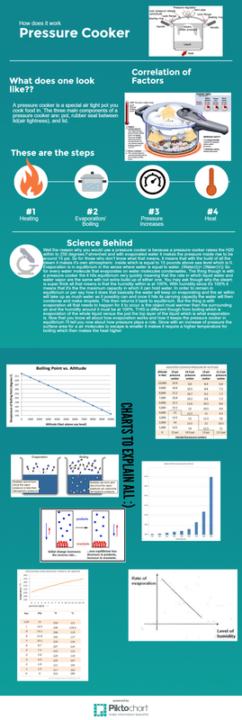
For this project we had to explain a chemical equilibrium in a system. We had to research and look into the different principles and factors that affect our system we chose. We chose our topic by rating a giant list of equilibrium that are common in today's society. The four that interested me the most were all water related but as I progressed through the project I found I really did not have an interest in water equilibrium so I switched half way through to a pressure cooker. Our goal for the end of the project was to make an info graphic that is easy to read and explains your topic thoroughly. Explanation of topics included within
Reflection During this project I had to do it independently which was kind of a drag. In STEM we are usually put into groups and we collaborate and stimulate each other to do better and keep each other on task. I mean we did have people at our table who were doing similar topics to what we chose but none of it really crossed paths and was worth really talking to. In this project I had a lot of time where I was just straight up procrastinating because every time I would find something a little interesting on my project it led me to a different subject and I would research that instead. As I researched my original topic of Ocean Pollution I found very little to do with chemical equilibrium so I maybe spent the first few weeks researching a topic that had loose ends for me. I ended up switching to the Science behind a Pressure Cooker because I like cooking and just why not? During this project once I really figured out what I was doing the rest of the project went very smoothly and I was able to gather all my information very easily and quickly. So three things I feel like I could of improved on or did better are using my time more efficiently, figuring out what I really wanted to do, and use less words in my info graphic. But the thing is in my info graphic I'm very weary on how it is portrayed to the public because I feel mine should not have this big of a paragraph smack dab in the middle of info graphic. But the thing is I kinda wanted it to be this way so that with this giant paragraph of reading everything isn't too spread out for people to look all over for it and plus since the information is so condensed they can then read it and have all the knowledge at once so the graphs therefore make sense. So basically condensed info means more knowledge so everything makes sense and they don't have to search all over for the information if something doesn't make sense at first. But then with time I feel like I could of really used my time better because that's like 10 hrs of useless work that wasn't contributed to my project. Three things I feel I did really well was using my time efficiently once I had my correct topic in mind, researching my topic in great depth, and portraying my info graphic in very eye pleasing way. Once I had my topic in mind everything just fell together so well I didn't waste any time and my project was then researched and finished very quickly in relative to the time we had left in class so like 3 or 4 days of class left to finalize. When I said researching my topic in great depth I didn't know how much science went into evaporation and boiling. I maybe went through 6 or 7 sites and learned all about those two subjects plus the contributing factors like humidity/pressure. I feel my info graphic is very nice because when I see it I see a nice simple explanation which is very calming to the mind but as you scroll further down you start to see the science and data that explain everything that goes into it. I don't know if this how other people's minds work but this very pleasing to me. So this what I feel like I did really well. |
